Technical Memorandum
DATE: June 2, 2017
TO: David Mohler, Executive Director of Planning, Massachusetts Department of Transportation
FROM: Steven Andrews
RE: The Implications of Changing Demographics on Major Service Changes, 1980–2010
When a transit agency proposes major service changes, planners conduct Title VI service equity analyses to assess whether the changes might unintentionally discriminate against protected populations. The equity analyses compare the demographics of the affected protected population (minority or low-income) to those of the service area or the impacts of the changes on the protected population versus their counterparts (nonminority and non-low-income). In general, the Central Transportation Planning Staff (CTPS), staff to the Boston Region Metropolitan Planning Organization, uses data from the most recent U.S. Census as one source to evaluate whether a change might have disparate impacts on minority and low-income populations.
However, these equity analyses may not accurately assess the risk of discrimination for the following reasons:
Planners determine if a service change might result in disparate impacts by using the most current census data to compare the demographics of the project area to the demographics of the service area. The purpose of this study was to determine whether planners conducting service equity analyses might draw different conclusions about how to restructure service and mitigate the effects of service changes depending upon whether they use current or recent demographics or projected demographics in their analyses.
In reporting the results of this study, this document first examines the demographic changes of the region over time, and then shows how those shifts may have affected the results of Massachusetts Bay Transportation Authority (MBTA) service equity analyses.
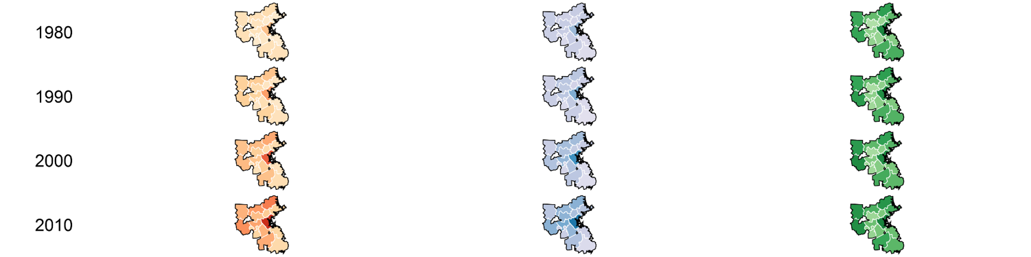
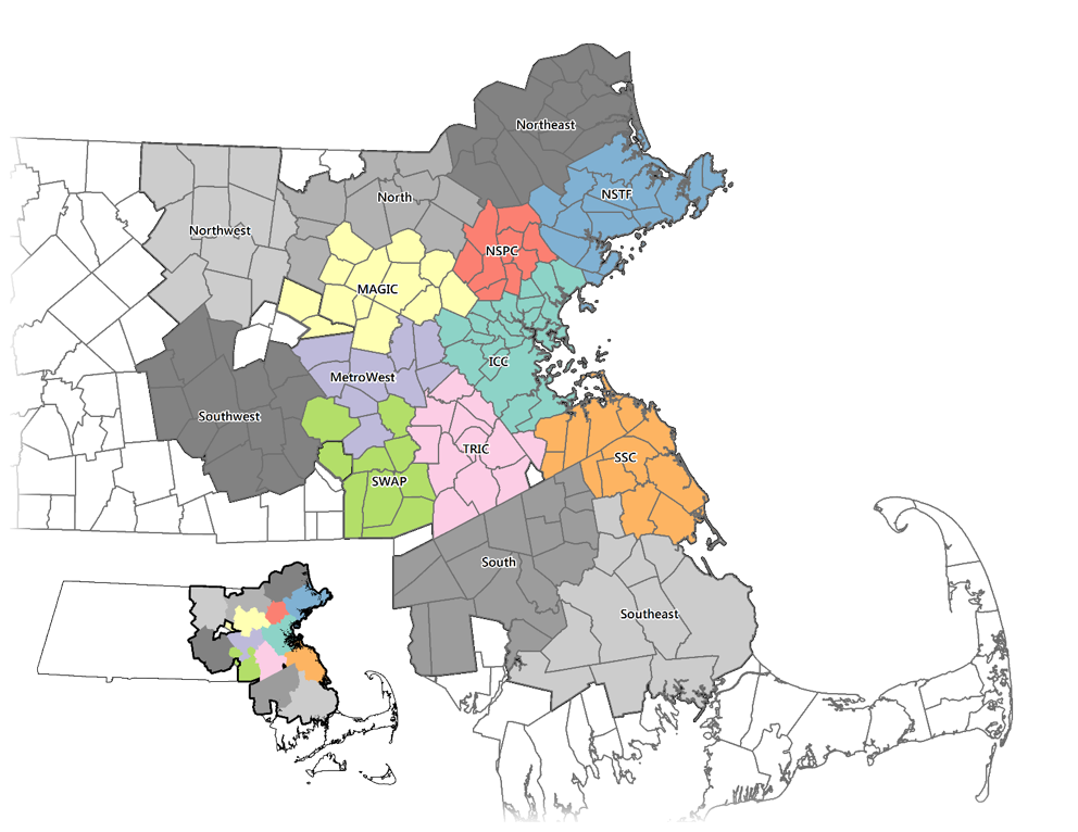
In this section, we discuss how the demographics of the MBTA service area (175 municipalities) have changed since 1980 for both the entire service area and, to contextualize the effects of project-level service equity analyses, for the municipalities in the Inner Core subregion within the planning area of the Metropolitan Area Planning Council (MAPC).1 The Inner Core is composed of the relatively dense municipalities within Route 128 and is one of eight subregions in MAPC’s area. For purposes of this study, in addition to eight MAPC subregions, we identified an additional six subregions within the MBTA service area (Figure 1).
This section summarizes the demographic changes and then provides detailed information in tables and graphical form, which illustrate the demographic changes for both the MBTA service area as a whole and for the Inner Core. We use municipal or subregion data to demonstrate changes in service areas, and municipal and census-tract data within the Inner Core to present demographic shifts in projects, towns, and census tracts (Appendix A).
The minority population in the MBTA service area has increased significantly, from 8 percent in 1980 to 26 percent in 2010 (Table 1). In the Inner Core, where most of the MBTA’s riders access service, the proportion of minority residents increased from 16 percent in 1980 to 41 percent in 2010; the minority population percentages have increased dramatically in the municipalities just outside the center of the Inner Core (Tables 2 and 3). The minority percentages of the service area and the Inner Core have become more similar since 1980. These trends are generally reflected in the change in the proportion of foreign-born populations living in the region (Figures 2, 3, and 4). The percentage point changes in foreign-born status and minority status between 1980 and 2010 are strongly correlated; foreign-born status and low-income status, and minority status and low-income status, are not strongly correlated (Figure 4).
Figure 1
Subregions within the MBTA Service Area
ICC = Inner Core Committee. MAGIC = Minuteman Advisory Group on Interlocal Coordination. MAPC = Metropolitan Area Planning Council. MetroWest = MetroWest Regional Collaborative. NSPC = North Suburban Planning Council. NSTF, North Shore Task Force. SSC, South Shore Coalition. SWAP = SouthWest Advisory Planning Committee. TRIC = Three Rivers Interlocal Council.
Notes: 1) Areas shown in color delineate the eight MAPC subregions. We defined the six regions shown in gray for this study. 2) Dover is member of both TRIC and SWAP; we included it with TRIC municipalities. 3) Milton is a member of the ICC and TRIC; we included it with ICC municipalities. 4) Needham is a member of TRIC and ICC; we included it with TRIC municipalities. 5) We did not include municipalities that are not in the MBTA service area in our analysis (Bolton, Hudson, and Milford).
Source: Central Transportation Planning Staff.
The percentage of low-income households has remained comparatively constant since 1980. The percentage of low-income households in the region ranged from 29 percent in 1990 to 31 percent in 2010 (Table 1). In the Inner Core, this percentage ranged from 35 percent in 1990 to 37 percent in 2010 (Tables 2 and 3). Outside the Inner Core, the percentage of low-income households tended to increase (Table 2 and Figure 2).
Table 1
Summary of MBTA Service Area Demographic Changes, 1980–2010
Topic |
1980 |
1990 |
2000 |
2010 |
Total population |
4,221,371 |
4,396,352 |
4,663,565 |
4,833,606 |
Percentage of minority population |
8.24% |
13.43% |
19.93% |
26.19% |
Number and percentage of minority |
209 |
273 |
316 |
356 |
Percentage of foreign-born population |
8.9% |
10.4% |
13.9% |
17.0% |
Percentage of low-income households |
29.52% |
29.42% |
30.07% |
31.42% |
Median household Income |
$18,383 |
$39,541 |
$54,302 |
|
Low-income threshold |
$11,030 |
$23,725 |
$32,581 |
|
Number and percentage of low-income |
109 |
105 |
118 |
137 |
Notes: 1) Dollar values in brackets represent the estimated value in 2012 dollars. 2) The low-income threshold is 60 percent of the MBTA service area’s median household income. 3) Income values for the 1980, 1990, and 2000 Censuses lag by a year. 4) In 2010, we used 2008–2012 American Community Survey data adjusted to 2012 dollars.
Source: U.S. Census, Bureau of Labor Statistics, calculated values.
Almost half of the growth in the minority and foreign-born populations occurred in the Inner Core; a quarter of the growth in the number of low-income households occurred in the Inner Core (Table 4). Most of the growth in the number of low-income households occurred in municipalities outside the MAPC region, although within the region, the Inner Core was home to the largest increase in low-income households.
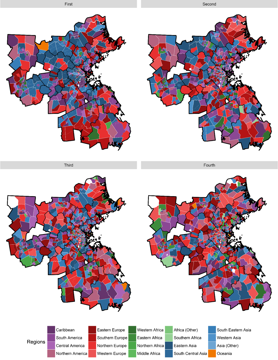
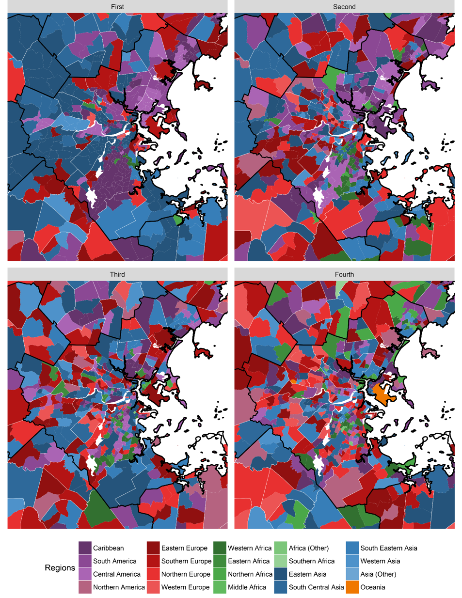
Within the MBTA service area, more than 50,000 foreign-born residents originated from the following areas (Figures 5 and 6):
The share of the foreign-born population from each of these regions varies across municipalities. In both Boston and Lynn, the largest share of the foreign-born population is comprised of people from the Caribbean. Quincy, Malden, Cambridge, and Brookline are home to many people born in Eastern Asia. Somerville, Chelsea, and Waltham are home to many people who were born in Central America. Revere, Somerville, and Medford are home to many people born in South America. Within these municipalities, there also are many foreign-born people from other regions. For example, while there are few municipalities where the largest share of the foreign-born population was born in any part of Africa, there are certainly sizable numbers of people from Africa within the municipalities. For example, many people born in Western Africa live in Dorchester, Roxbury, and Mattapan.
In the preceding section, we summarized the region’s demographic changes at a very high level, citing only the most salient patterns of the past four decades. To provide additional context, the tables and figures that follow show data at a more granular level and contain a wealth of data about specific locations. These data allow readers to explore and extrapolate according to their individual interests.
Without knowing more about the demographics of the areas surrounding specific MBTA services, it is difficult to determine the implications of these changes for equity analyses. If the demographics of the areas near MBTA services remain constant while the minority population of the service area increases, fewer services would be defined as “minority services”—services that attend a greater proportion of minority riders than the proportion of minorities who live in the service area. If growth in the minority population is concentrated in the areas near MBTA services, the growth in the minority population with access to transit service may outpace the regional growth in minority population, leading to an increase in the number of services considered minority services. The same issues hold for changes in low-income household patterns. We discuss the implications of how the demographics have changed around specific MBTA services and their relation to service-area demographic shifts in the next section of this report.
Table 2
Summary of Demographic Changes by MBTA Subregion, 1980–2010
|
Minority Pct. |
Minority Pct. |
Minority Pct. |
Minority Pct. |
Minority Pct. |
Foreign-Born Pct. |
Foreign-Born Pct. |
Foreign-Born Pct. |
Foreign-Born Pct. |
Foreign-Born Pct. |
Low-Income Pct. |
Low-Income Pct. |
Low-Income Pct. |
Low-Income Pct. |
Low-Income Pct. |
Subregion |
1980 |
1990 |
2000 |
2010 |
2010÷ |
1980 |
1990 |
2000 |
2010 |
2010÷ |
1980 |
1990 |
2000 |
2010 |
2010÷ |
ICC |
16 |
24 |
34 |
41 |
2.6 |
13 |
17 |
23 |
26 |
2.0 |
36 |
35 |
36 |
37 |
1.0 |
NSTF |
2 |
4 |
7 |
10 |
5.1 |
7 |
7 |
7 |
10 |
1.4 |
27 |
28 |
28 |
30 |
1.1 |
NSPC |
2 |
4 |
7 |
12 |
5.3 |
6 |
6 |
8 |
11 |
2.0 |
18 |
20 |
20 |
23 |
1.3 |
MAGIC |
4 |
7 |
10 |
17 |
4.3 |
7 |
8 |
11 |
15 |
2.1 |
13 |
14 |
15 |
17 |
1.3 |
MetroWest |
5 |
9 |
15 |
22 |
5.0 |
7 |
9 |
14 |
18 |
2.4 |
19 |
20 |
22 |
25 |
1.3 |
SWAP |
2 |
3 |
5 |
8 |
3.7 |
5 |
4 |
5 |
7 |
1.5 |
19 |
16 |
17 |
18 |
1.0 |
TRIC |
3 |
6 |
12 |
20 |
7.4 |
7 |
8 |
11 |
14 |
2.0 |
18 |
20 |
21 |
24 |
1.3 |
SSC |
2 |
3 |
5 |
8 |
4.6 |
4 |
4 |
4 |
7 |
1.5 |
21 |
22 |
23 |
25 |
1.2 |
Outside MAPC |
5 |
11 |
17 |
23 |
4.4 |
7 |
7 |
10 |
13 |
1.9 |
30 |
30 |
31 |
32 |
1.1 |
Northeast |
6 |
15 |
22 |
29 |
4.8 |
7 |
9 |
12 |
15 |
2.1 |
33 |
33 |
32 |
34 |
1.0 |
North |
5 |
12 |
18 |
24 |
4.8 |
6 |
9 |
12 |
14 |
2.3 |
26 |
26 |
27 |
29 |
1.1 |
Northwest |
5 |
10 |
15 |
20 |
4.1 |
7 |
6 |
7 |
9 |
1.3 |
31 |
32 |
33 |
34 |
1.1 |
Southwest |
5 |
11 |
18 |
26 |
5.1 |
7 |
7 |
10 |
15 |
2.3 |
32 |
33 |
35 |
35 |
1.1 |
South |
5 |
9 |
16 |
21 |
4.3 |
7 |
7 |
9 |
11 |
1.6 |
30 |
29 |
30 |
31 |
1.1 |
Southeast |
5 |
4 |
6 |
7 |
1.5 |
4 |
3 |
3 |
4 |
1.1 |
29 |
28 |
27 |
27 |
0.9 |
Service Area |
8 |
13 |
20 |
26 |
3.2 |
9 |
10 |
14 |
17 |
1.9 |
30 |
29 |
30 |
31 |
1.1 |
|
Table 3
Summary of Inner-Core Community and Service-Area Demographics, 1980–2010
|
Minority |
Minority |
Minority |
Minority |
Minority |
Foreign-Born |
Foreign-Born |
Foreign-Born |
Foreign-Born |
Foreign-Born |
Low-income |
Low-income |
Low-income |
Low-income |
Low-income |
|
1980 |
1990 |
2000 |
2010 |
2010÷ |
1980 |
1990 |
2000 |
2010 |
2010÷ |
1980 |
1990 |
2000 |
2010 |
2010÷ |
Boston |
32 |
41 |
51 |
53 |
1.6 |
15 |
20 |
26 |
27 |
1.7 |
44 |
42 |
42 |
43 |
1.0 |
Cambridge |
20 |
28 |
35 |
38 |
1.9 |
18 |
22 |
26 |
27 |
1.5 |
39 |
35 |
34 |
33 |
0.8 |
Quincy |
2 |
9 |
22 |
34 |
16.9 |
8 |
11 |
20 |
28 |
3.3 |
31 |
31 |
32 |
35 |
1.1 |
Lynn |
7 |
20 |
38 |
52 |
7.4 |
9 |
14 |
23 |
30 |
3.2 |
40 |
43 |
45 |
49 |
1.2 |
Newton |
5 |
9 |
14 |
20 |
3.8 |
11 |
13 |
18 |
21 |
1.8 |
17 |
17 |
17 |
20 |
1.2 |
Somerville |
5 |
16 |
27 |
31 |
5.7 |
17 |
22 |
29 |
26 |
1.5 |
39 |
35 |
33 |
33 |
0.8 |
Waltham |
5 |
12 |
22 |
31 |
6.5 |
12 |
15 |
20 |
28 |
2.2 |
27 |
27 |
28 |
31 |
1.1 |
Malden |
4 |
12 |
30 |
48 |
13.2 |
9 |
14 |
26 |
41 |
4.4 |
34 |
34 |
35 |
41 |
1.2 |
Brookline |
10 |
15 |
21 |
27 |
2.8 |
17 |
21 |
27 |
25 |
1.5 |
27 |
26 |
25 |
26 |
1.0 |
Medford |
4 |
8 |
15 |
24 |
5.5 |
11 |
12 |
16 |
21 |
1.9 |
29 |
29 |
31 |
30 |
1.0 |
Revere |
2 |
9 |
21 |
38 |
24.4 |
9 |
13 |
21 |
32 |
3.4 |
37 |
39 |
44 |
43 |
1.2 |
Arlington |
3 |
6 |
10 |
16 |
4.8 |
11 |
12 |
14 |
16 |
1.5 |
23 |
25 |
24 |
24 |
1.0 |
Everett |
3 |
9 |
25 |
46 |
15.2 |
10 |
11 |
22 |
39 |
3.7 |
37 |
38 |
40 |
44 |
1.2 |
Chelsea |
17 |
41 |
62 |
75 |
4.3 |
13 |
22 |
36 |
44 |
3.5 |
49 |
48 |
53 |
49 |
1.0 |
Watertown |
3 |
6 |
10 |
18 |
5.8 |
18 |
17 |
20 |
24 |
1.4 |
25 |
26 |
26 |
25 |
1.0 |
Milton |
3 |
7 |
16 |
24 |
8.5 |
9 |
7 |
10 |
12 |
1.4 |
18 |
19 |
20 |
21 |
1.2 |
Melrose |
2 |
3 |
6 |
10 |
6.5 |
6 |
6 |
6 |
12 |
2.0 |
25 |
25 |
25 |
23 |
0.9 |
Saugus |
1 |
2 |
3 |
10 |
8.1 |
7 |
5 |
5 |
10 |
1.5 |
22 |
26 |
27 |
30 |
1.3 |
Belmont |
3 |
6 |
10 |
19 |
5.6 |
12 |
12 |
15 |
22 |
1.8 |
19 |
19 |
19 |
19 |
1.0 |
Winthrop |
1 |
3 |
7 |
11 |
8.9 |
6 |
6 |
9 |
10 |
1.6 |
28 |
29 |
27 |
32 |
1.1 |
ICC |
16 |
24 |
13 |
41 |
2.6 |
13 |
17 |
23 |
26 |
2.0 |
36 |
35 |
36 |
37 |
1.0 |
Service Area |
8 |
13 |
20 |
26 |
3.2 |
9 |
10 |
14 |
17 |
1.9 |
30 |
29 |
30 |
31 |
1.1 |
ICC: Service Area |
1.9x |
1.8x |
1.7x |
1.5x |
— |
1.5x |
1.6x |
1.6x |
1.6x |
— |
1.2x |
1.2x |
1.2x |
1.2x |
— |
ICC = Inner core community. Pct. = Percentage.
Sources: Central Transportation Planning Staff; U.S. Census.
Figure 2
Minority, Foreign-Born, and Low-Income Population
Percentages By Municipality in the MBTA Service Area, 1980–2010
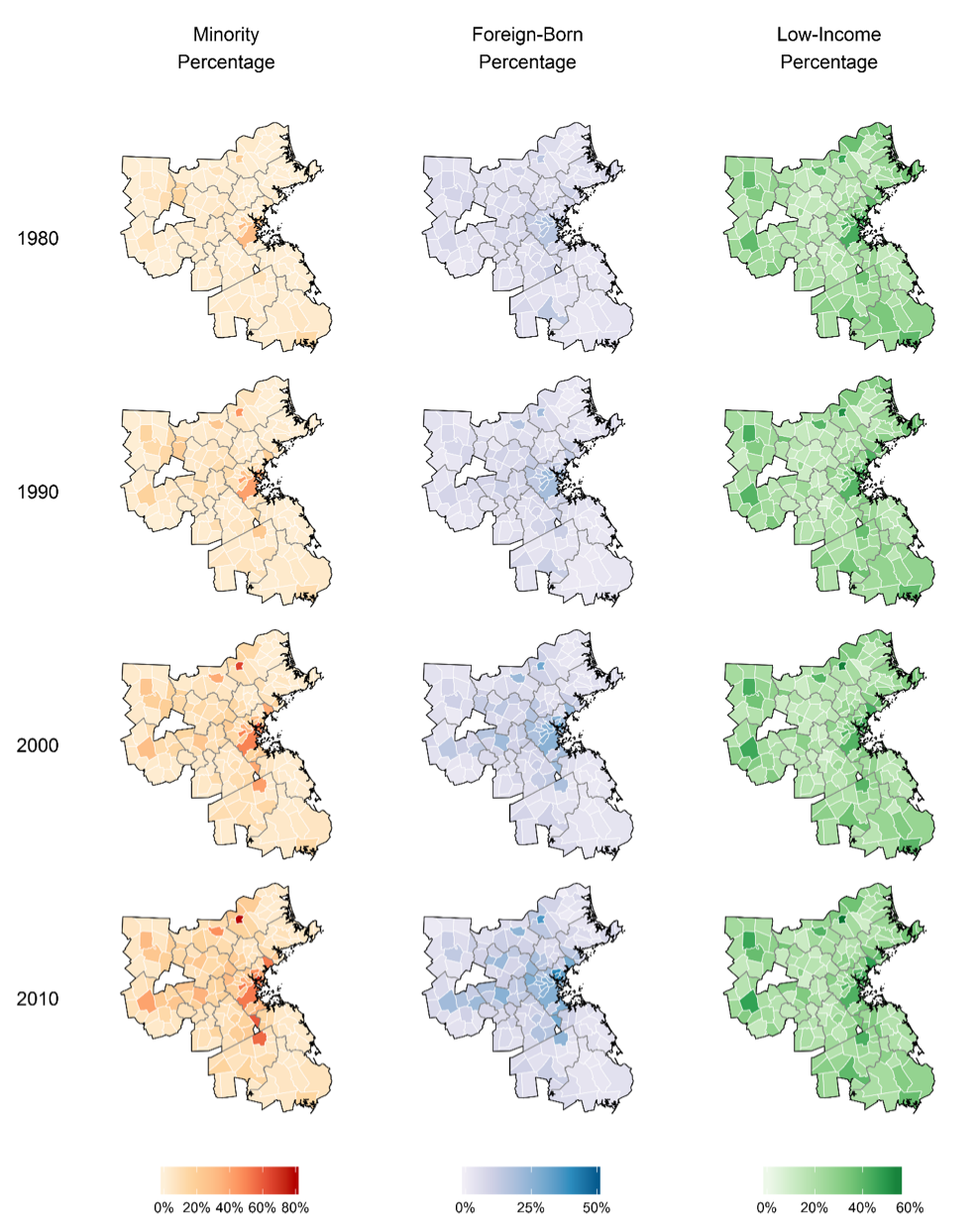
Figure 3
Relationship between the Percentage Point Changes in Foreign-Born, Minority, and Low-Income Populations
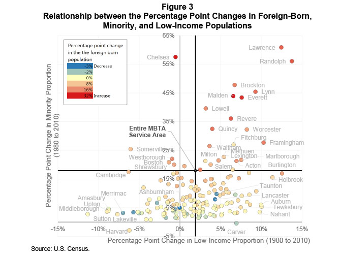
Source: U.S. Census.
Figure 4
Correlation Matrix: Percentage Point Change, 1980–2010
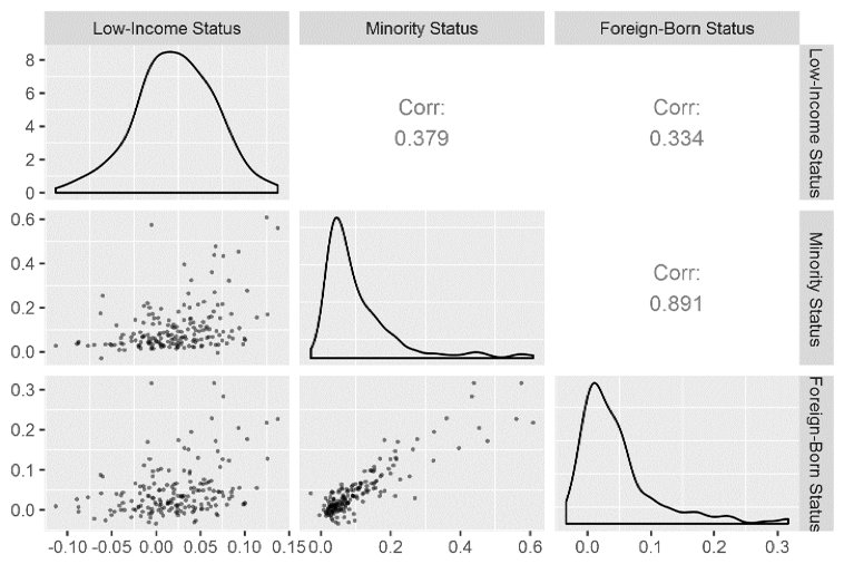
Table 4
Percent of Total MBTA Service Area Growth by Subregion, 1980–2010
Region |
Minority Population |
Foreign-Born Population |
Total Population |
Low-Income Households |
All Households |
ICC |
46 |
51 |
18 |
23 |
21 |
TRIC |
5 |
4 |
4 |
6 |
5 |
MetroWest |
5 |
6 |
5 |
6 |
5 |
NSTF |
3 |
2 |
4 |
6 |
6 |
NSPC |
2 |
3 |
2 |
5 |
4 |
MAGIC |
2 |
3 |
3 |
3 |
3 |
SSC |
2 |
2 |
3 |
6 |
6 |
SWAP |
1 |
1 |
6 |
2 |
4 |
Non-MAPC Subregion |
35 |
28 |
56 |
43 |
45 |
Total |
100% |
100% |
100% |
100% |
100% |
ICC = Inner Core Committee. MAGIC = Minuteman Advisory Group on Interlocal Coordination. MAPC = Metropolitan Area Planning Council. MetroWest = MetroWest Regional Collaborative. NSPC = North Suburban Planning Council. NSTF, North Shore Task Force. SSC, South Shore Coalition. SWAP = SouthWest Advisory Planning Committee. TRIC = Three Rivers Interlocal Council.
Source: U.S. Census.
Figure 5
Top-Four Places of Birth for the Foreign-Born Population
in the MBTA Service Area by Census Tract
Sources: American Community Survey 2007–2012; U.S. Census.
Figure 6
Top-Four Places of Birth for Foreign-Born Population in MBTA Service Area, by Census Tract: Inner Core and Surrounding Areas
Sources: American Community Survey 2007–2012; U.S. Census.
This section discusses the interplay between project-level and service-area demographic changes over time, reviews how those changes affect service equity analyses through a series of hypothetical changes to MBTA bus services, compares demographic projections to actual demographic changes, and reviews three implemented projects to show whether having accurate projections would have led to notably different policy actions.
We found that the demographics of the MBTA’s service area generally are becoming more similar to the demographics of the people who live near MBTA service. Because of this trend, in the future there may be less need for the MBTA to conduct service equity analyses of potential disparate impact on minority populations or disparate burden on low-income populations for service changes.
While using projected demographic data in service equity analyses is certainly possible, and as we show in this document can help avert potential unintentional discrimination and unnecessary mitigation, the MBTA may want to use projected data only when the most current data indicates a finding of no disparate impact. Using projected demographic data to overturn a finding of disparate impact may result in unintentionally ignoring what is actually a disparate impact.
After reviewing the equity analyses for three previous MBTA major rapid transit service changes, we found that in general, planners would have found the same results and made the same policy actions whether they used then current or accurately projected demographic data.
The MBTA may want to revisit periodically the equity analyses of major service changes for projects that result in a finding close to the disparate impact or disproportionate burden (DI/DB) threshold to determine whether the finding and response (mitigating the change or not) were appropriate given updated demographic data. Two datasets that may be used for this purpose are the U.S. Census Bureau Five-year American Community Survey (ACS), which is an annually updated compilation of five years of sample data, and the most recent MBTA passenger survey (required every five years).
Using projected demographic data for service equity analyses requires a methodology to project demographic data at both a regional and a local level. This may range from simply extrapolating from past censuses—a very coarse methodology—to significantly more complex methods using many variables. It also requires development of procedures and guidelines to determine the appropriate horizon year for analysis. The effects of changing service on bus routes might warrant using a different analysis year than eliminating or implementing a significant rapid transit system change.
The Federal Transit Administration (FTA) requires transit agencies to take remedial action when a major service change disproportionately impacts minority populations or people living in low-income households.
The MBTA developed specific criteria to assess whether a planned change might result in unintentional discrimination based on a finding of:
The MBTA’s threshold for determining when adverse effects of major service changes may result in disparate impacts on minority and/or disproportionate burdens on low-income populations is 20 percent. If the ratio of the impact on minority to non-minority populations or low-income to non-low-income populations is more than 1.20 (or 20 percent), then the proposed change would be considered to pose a potential disparate impact or disproportionate burden. For example, if the service area’s population is 10 percent minority, the MBTA would not find a disparate impact for any negative service change that affects an area where 12 percent (120 percent of 10 percent) or less of the population is minority. The MBTA would find that implementing a beneficial major service change in any area where less than 8 percent (80 percent of 10 percent) of the population is minority results in a disparate benefit finding.2 The threshold values in these cases are 12 and 8 percent.
Because the DI/DB threshold compares the population affected by the change to the service-area population, a finding of potential discrimination is based on the project- or route-level and service-area demographics. The following examples illustrate how differences in the minority shares of population along different routes, and changes in these shares over time, can affect the findings of disparate impact analyses. These examples are based on a hypothetical set of routes and a hypothetical region described in Table 5.
Disparate Impact Examples:
Disparate Benefit Examples:
Table 5
Hypothetical Examples of Demographic Changes
and Their Impacts on Service Equity Analysis Findings, 1980, 1990
|
Minority Share |
Minority Share |
MBTA service area |
10% |
20% |
Threshold to find disparate impact |
120% × 10% = 12% |
120% × 20% = 24% |
Threshold to find disparate benefit |
80% × 10% = 08% |
80% × 20% = 16% |
Route A |
20% (2.0) ■● |
20% (1.0) ●● |
Route B |
10% (1.0) ●● |
30% (1.5) ■● |
Route C |
5% (0.5) ●■ |
14% (0.7) ●■ |
Route D |
40% (4.0) ■● |
50% (2.5) ■● |
■ = Disparate impact. ● = No disparate impact/benefit. ■ = Disparate benefit.
Note: A disparate impact from a service change occurs when the ratio of a route’s minority share to the service area’s minority share exceeds 1.2 for a negative change and does not exceed 0.8 for a positive change. Values in parentheses contain this ratio. The first symbol indicates a finding of disparate impact, and the second indicates a finding of disparate benefit.
This section discusses the results of analyzing hypothetical changes to MBTA bus routes to determine the equity impacts at different points in time; first, comparing how the demographics near bus routes and the region have changed since 1980; and then comparing the implications of using the most current but outdated demographic data and using projected demographic data.
How have local and regional demographics changed, and what implications does this have for the MBTA?
To answer these questions, we conducted independent disparate benefit/burden service equity analyses (minority-based tests) and disproportionate benefit/burden analyses (income-based tests) for 170, or most, of the MBTA’s bus routes, including some that have only one or two trips a day or serve very specific populations.3 We reviewed what the results of a DI/DB analysis would show if the MBTA implemented a positive or negative service change to each route without making changes on any other route. This is a purely hypothetical exercise designed to reveal how the demographics around all of the MBTA’s bus routes have changed in relation to service-area demographics since 1980. In reality, the MBTA rarely makes significant changes to a single route at a time—major service changes are typically implemented as a package with some people benefiting and some people being negatively affected.
The results of these analyses, summarized in Table 6, show that over the last 30 years:
Two factors influence these trends, demographic changes at the route level and demographic changes at the service-area level (Figure 7). Between 1980 and 2010, changes in demographics for fewer than 10 routes resulted in findings switching from one of potential disparate impact to one of no potential disparate impact. In each of these cases, the minority percentage of the population around the routes increased; however, the service area’s minority share grew enough to offset the route-level growth. For the income-based disproportionate-burden metric, most of the routes that no longer result in a disproportionate-burden finding resulting from a negative service change did so because the percentage of nearby low-income households decreased.
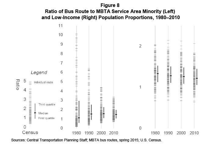
Overall, the distribution of route-to-regional minority percentages has become more narrow (Table 7 and Figure 8); at the same time, the median minority ratio has increased since 1980, peaking in 2000. However, the distribution of the low-income ratios has remained relatively constant.
If these demographic trends continue into the future, and the MBTA does not change its DI/DB policy, changes in MBTA services may result in fewer findings of potential disparate impacts and disproportionate burdens.
Table 6
Effects of Demographic Changes on Service Equity Analyses
|
1980 |
1990 |
2000 |
2010 |
Visualization |
Minority Status |
|
|
|
|
|
Number of routes that would result in DI/DB finding: |
|
|
|
|
|
Disparate benefit |
59 |
32 |
12 |
9 |
|
Neither |
28 |
35 |
37 |
44 |
|
Disparate impact |
83 |
103 |
121 |
117 |
|
…as a percentage of all routes: |
|
|
|
|
|
Disparate benefit ■ |
35% |
19% |
7% |
5% |
|
Neither ■ |
16% |
21% |
22% |
26% |
|
Disparate impact ■ |
49% |
61% |
71% |
69% |
|
|
|
|
|
|
|
Income Status |
|
|
|
|
|
Number of routes that would result in DI/DB finding: |
|
|
|
|
|
Disproportionate benefit |
5 |
4 |
5 |
6 |
|
Neither |
51 |
63 |
66 |
71 |
|
Disproportionate burden |
114 |
103 |
99 |
93 |
|
…as a percentage of all routes: |
|
|
|
|
|
Disproportionate benefit ■ |
3% |
2% |
3% |
4% |
|
Neither ■ |
30% |
37% |
39% |
42% |
|
Disproportionate burden ■ |
67% |
61% |
58% |
55% |
|
|
|
|
|
|
|
Minority or Income Status |
|
|
|
|
|
Number of routes that would result in either DI or DB finding |
126 |
120 |
132 |
125 |
|
…as a percentage of all routes |
74% |
71% |
78% |
74% |
|
|
|
|
|
|
Notes: 1) The values for “disparate impact/disproportionate burden” should be interpreted as: “If the MBTA were to reduce service on each route individually, how many of these service reductions would result in a finding of potential disparate impact/disproportionate burden?” 2) The values for “disparate/disproportionate benefit” should be interpreted as: “If the MBTA were to add service to each route individually, how many of these service increases would result in a finding of potential disparate/disproportionate benefit?” 3) “Neither” represents routes for which any change, a service increase or decrease, would not result in a finding of disparate impacts.
Sources: Central Transportation Planning Staff; MBTA Bus Routes, spring 2015; U.S. Census.
Figure 7 Comparison of the Change in Bus Route Demographics and the Demographics of the MBTA Service Area as Related to Equity Analyses, Conducted with 1980 Data and 2010 Data
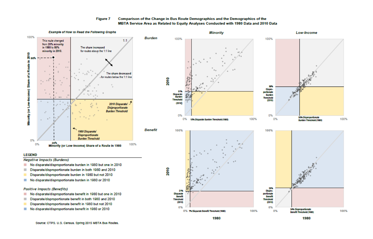
Table 7
Ratio of Bus Route to MBTA Service Area
Minority and Low-Income Population Proportions, 1980–2010
|
Minority Ratio |
Minority Ratio |
Minority Ratio |
Minority Ratio |
Low-Income Ratio |
Low-Income Ratio |
Low-Income Ratio |
Low-Income Ratio |
|
1980 |
1990 |
2000 |
2010 |
1980 |
1990 |
2000 |
2010 |
Minimum |
0.2 |
0.3 |
0.6 |
0.7 |
0.7 |
0.7 |
0.7 |
0.6 |
First quartile |
0.6 |
0.9 |
1.1 |
1.1 |
1.1 |
1.1 |
1.1 |
1.1 |
Median |
1.1 |
1.5 |
1.6 |
1.5 |
1.3 |
1.3 |
1.3 |
1.2 |
Third quartile |
2.9 |
2.5 |
2.3 |
2.0 |
1.5 |
1.5 |
1.5 |
1.4 |
Maximum |
10.1 |
6.4 |
4.4 |
3.4 |
2.0 |
2.1 |
2.1 |
2.1 |
IQR |
2.3 |
1.6 |
1.2 |
0.9 |
0.4 |
0.4 |
0.4 |
0.4 |
Range |
10.0 |
6.1 |
3.8 |
2.7 |
1.4 |
1.5 |
1.5 |
1.4 |
IQR = Interquartile range, third quartile – first quartile.
Sources: Central Transportation Planning Staff; MBTA bus routes, spring 2015; U.S. Census.
Would the MBTA find any benefit in using projected demographic data when conducting its service equity analyses?
We reviewed what might have happened if planners had used projected demographics in 1990 and 2000 to evaluate the impacts of changes ten years from the base year. It is useful to think of this analysis as “if planners were to make a change in 2010, before the actual 2010 Census demographic data were released, how would the results of using projected 2010 demographics differ from the results when using the latest available data (2000 Census)?” How would these results have compared to the actual 2010 Census demographics? Could they have avoided mitigation that later proved to be unnecessary, based on demographic changes over time? Would they have been able to prevent unintentional disparate impacts before they became observable? Would they use inaccurate projections that would have stopped them from mitigating a service change they should have addressed?
We found that if planners were to analyze major service changes in 2010 (before 2010 Census demographic data were available), and if planners used simple straight-line extrapolation of the minority percentages between 1990 and 2000 (the most current demographic data available at the time of the analysis) to 2010, they would have found and been able to mitigate disparate impacts on four routes that they would not have if they used current demographic data. Using the projected demographics instead of current but outdated demographics would have resulted in reversing a finding of potential disparate impacts on only one route, and there were three routes for which use of projected demographics may have led to mitigation that was not necessary. CTPS did not find any cases where the use of projected demographics would have resulted in reversing a finding of disparate impact where that reversal later turned out to be unjustified. In most cases, the results of using projected demographics agree with the results of using the most current demographics (Figure 8).
Figure 9
Comparison of Equity Analysis Results using Current Demographics (2000), Projected 2010, and Actual 2010 Demographic Data
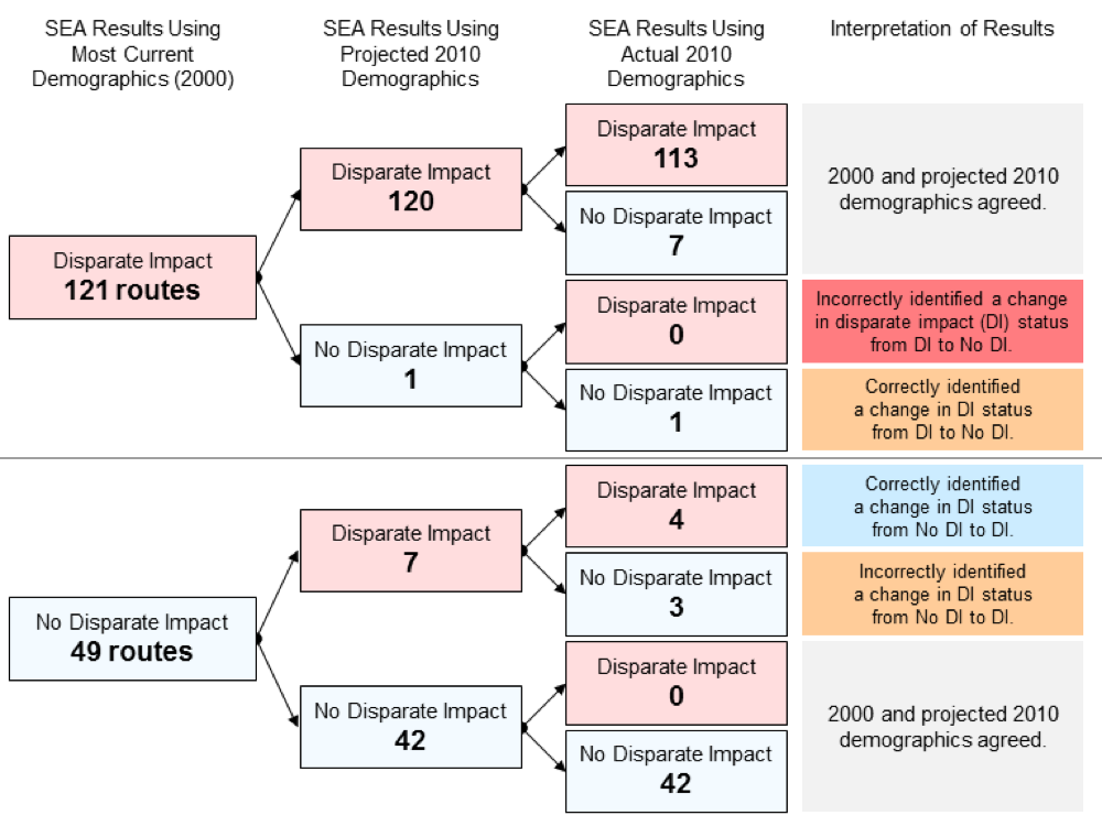
Sources: Central Transportation Planning Staff; MBTA bus routes, spring 2015; U.S. Census.
To see if these trends hold using a different set of years, we conducted the same analysis shifted 10 years earlier. We found that in 2000, if planners had used simple straight-line extrapolation of the minority percentages between 1980 and 1990 to 2000, they would have found (after they gained access to the 2000 Census demographics) seven routes where they would have been able to mitigate disparate impacts that they would not have if they used the most current demographics; and they would have stopped the MBTA from implementing mitigation that was not necessary for one route. Again, the results of using the most recent and projected demographics generally match (Figure 9).
Figure 10
Comparison of Equity Analysis Results using Current Demographics (1990), Projected 2000, and Actual 2000 Demographic Data
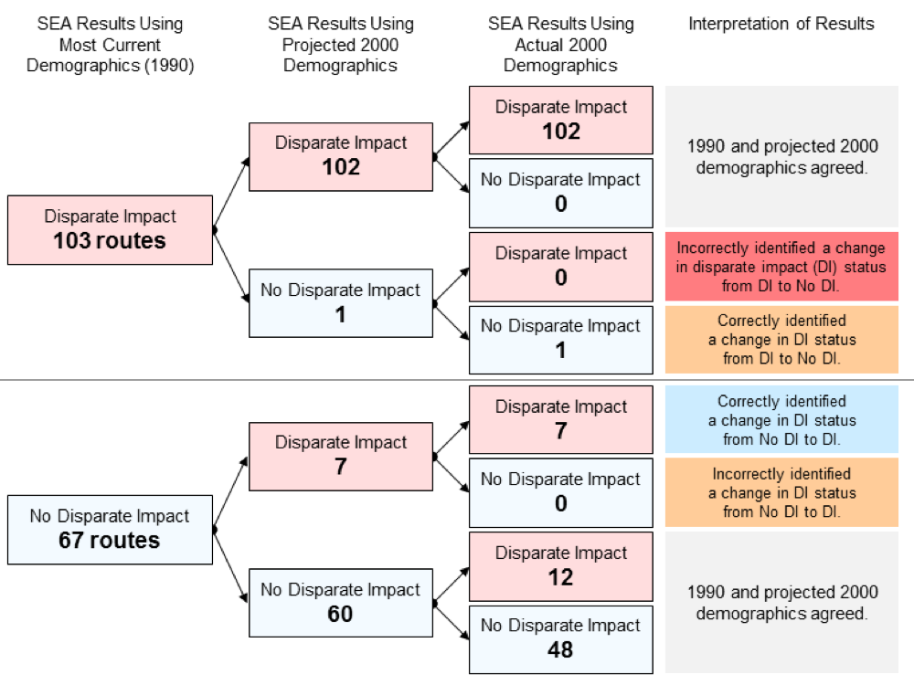
Sources: Central Transportation Planning Staff; MBTA bus routes, spring 2015; U.S. Census.
The two sets of analyses (2000 and 2010) generally agree. The most current (but still not recent) and projected demographics tend to result in the same service equity analysis results; and using projected demographics can reveal disparate impacts before planners have access to the actual demographic data.
If we completed this analysis today, projecting 2010 Census demographics to 2017 (the results of which are shown in Figure 10), we would find a single case where the MBTA has an opportunity to account for demographic shifts that lead to potential disparate impacts. We find 12 cases where using projected demographics would overturn a finding of disparate impact. In the previous two analyses, we found no cases where overturning a disparate impact finding using the most current demographic data was inaccurate. In the vast majority of cases, using projected and the most current demographics result in the same service equity analysis results.
If the MBTA were to adopt the use of projected demographics, it should be very careful about implementing negative service changes on routes where the minority share is decreasing and changes to service on the route currently would result in a disparate impact. If the minority share is predicted to fall below the disparate impact threshold, but those projections are not realized, the MBTA could ignore discrimination based on inaccurate projections. Similarly, overestimating future regional minority shares could result in failure to mitigate service reductions—planners might calculate a disparate impact threshold higher than what was realized, causing them to fail to identify disparate impacts on some routes.
Figure 11
Comparison of Equity Analysis Results using Current-Year (2010)
and Projected 2017 Demographic Data
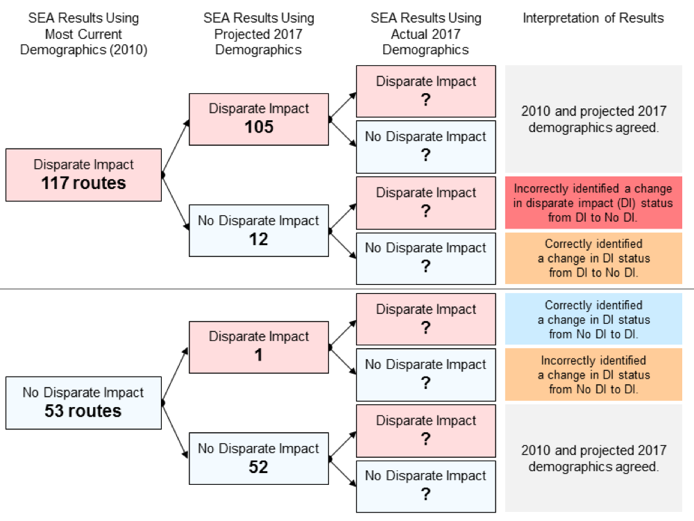
Sources: Central Transportation Planning Staff; MBTA bus routes, spring 2015; U.S. Census.
While the previous section reviewed the effects of projecting current but outdated demographic data to the project implementation date, we also are interested in how the demographics of surrounding areas change long after the projects are complete. Would the planners have made different decisions about whether mitigation was required or not if they accounted for the effects of implementing the change?
We conducted equity analyses using the realized future decennial Census demographic data for three rapid transit projects that were implemented between the 1980 and 1990 U.S. Censuses:
The results of these analyses are shown in Tables 8 and 9. With one exception, the results of the equity analyses would not have changed if planners knew for certain the demographics of the areas around the projects. The lone exception occurs in Retract to Heath Street: In 1980, the MBTA would have found a potential disproportionate burden that it would not have found using any of the other Census datasets.
When reviewing the demographics of the areas surrounding the service changes, we found that the share of low-income households decreased whether the MBTA implemented either an improvement or reduction in service (Table 10). However, the trends surrounding the change in minority shares are not as clear; we found every combination of service improvement/reduction and increase/decrease in the minority share.
Table 8
Results of Equity Analyses using Realized Minority Population Data, 1980–2010
|
Minority Proportion1 |
Minority Proportion1 |
Minority Proportion1 |
Minority Proportion1 |
Ratio2 |
Ratio2 |
Ratio2 |
Ratio2 |
Service Change |
1980 |
1990 |
2000 |
2010 |
1980 |
1990 |
2000 |
2010 |
Region |
8.2 |
13.4 |
19.9 |
26.2 |
— |
— |
— |
— |
Extend to Alewife |
11.9 |
18.1 |
23.9 |
26.8 |
1.4 ● |
1.3 ● |
1.2 ● |
1.0 ● |
Retract to Heath Street |
26.7 |
37.0 |
38.7 |
34.7 |
3.2 ■ |
2.8 ■ |
1.9 ■ |
1.3 ■ |
Realign the Orange Line: |
|
|
|
|
|
|
|
|
Remove stations |
67.9 |
70.0 |
66.8 |
61.1 |
8.2 ■ |
5.2 ■ |
3.4 ■ |
2.3 ■ |
Add new stations |
50.6 |
54.1 |
51.9 |
48.5 |
6.1 ● |
4.0 ● |
2.6 ● |
1.9 ● |
Simultaneous change: |
|
|
|
|
|
|
|
|
Lost service |
80.0 |
83.4 |
78.8 |
74.7 |
9.7 ■ |
6.2 ■ |
4.0 ■ |
2.9 ■ |
Gained service |
38.2 |
43.0 |
41.5 |
41.6 |
4.6 ● |
3.2 ● |
2.1 ● |
1.6 ● |
Changed stations |
63.9 |
65.7 |
63.1 |
56.2 |
7.8 ■ |
4.9 ■ |
3.2 ■ |
2.1 ■ |
1 Percent of total population. 2 project ratio ÷ service-area ratio. ■ = Disparate impact. ● = No disparate impact or disparate benefit.
Sources: Central Transportation Planning Staff; U.S. Census.
Table 9
Results of Equity Analyses using Realized Low-Income Population Data, 1980–2010
|
Low-income Proportion1 |
Low-income Proportion1 |
Low-income Proportion1 |
Low-income Proportion1 |
Ratio2 |
Ratio2 |
Ratio2 |
Ratio2 |
Service Change |
1980 |
1990 |
2000 |
2010 |
1980 |
1990 |
2000 |
2010 |
Region |
29.5 |
29.4 |
30.0 |
31.4 |
— |
— |
— |
— |
Extend to Alewife |
34.1 |
30.3 |
30.3 |
28.4 |
1.2 ● |
1.0 ● |
1.0 ● |
0.9 ● |
Retract to Heath Street |
39.5 |
32.7 |
32.7 |
32.2 |
1.3 ■ |
1.1 ● |
1.1 ● |
1.0 ● |
Realign the Orange Line: |
|
|
|
|
|
|
|
|
Remove stations |
52.4 |
49.8 |
49.4 |
47.7 |
1.8 ■ |
1.7 ■ |
1.6 ■ |
1.5 ■ |
Add new stations |
49.7 |
46.8 |
46.6 |
45.6 |
1.7 ● |
1.6 ● |
1.6 ● |
1.5 ● |
Simultaneous change: |
|
|
|
|
|
|
|
|
Lost service |
56.1 |
55.2 |
54.2 |
53.0 |
1.9 ■ |
1.9 ■ |
1.8 ■ |
1.7 ■ |
Gained service |
48.3 |
45.5 |
45.1 |
45.4 |
1.6 ● |
1.5 ● |
1.5 ● |
1.4 ● |
Changed stations |
51.3 |
48.2 |
48.1 |
45.7 |
1.7 ■ |
1.6 ■ |
1.6 ■ |
1.5 ■ |
1Percent of all households. 2project ratio ÷ service-area ratio. ■ = Disproportionate burden. ● = No disproportionate burden or disproportionate benefit.
Sources: Central Transportation Planning Staff; U.S. Census.
Table 10
Changes in Demographics for the MBTA Service Area and Affected Project Areas, 1980–2010
|
Service-Change Effect |
Minority Proportion |
Minority Proportion |
Minority Proportion |
Low-income Proportion |
Low-income Proportion |
Low-income Proportion |
Service Change |
|
1980 |
2010 |
Trend |
1980 |
2010 |
Trend |
Region |
|
8.2 |
26.2 |
▲ |
29.5 |
31.4 |
▲ |
Extend to Alewife |
Positive |
11.9 |
26.8 |
▲ |
34.1 |
28.4 |
▼ |
Retract to Heath Street |
Negative |
26.7 |
34.7 |
▲ |
39.5 |
32.2 |
▼ |
Realign the Orange Line |
|
|
|
|
|
|
|
Remove stations |
Negative |
67.9 |
61.1 |
▼ |
52.4 |
47.7 |
▼ |
Add new stations |
Positive |
50.6 |
48.5 |
▼ |
49.7 |
45.6 |
▼ |
Simultaneous change |
|
|
|
|
|
|
|
Gained service |
Positive |
38.2 |
41.6 |
▲ |
48.3 |
45.4 |
▼ |
Lost service |
Negative |
80.0 |
74.7 |
▼ |
56.1 |
53.0 |
▼ |
Changed service |
Neither |
63.9 |
56.2 |
▼ |
51.3 |
45.7 |
▼ |
▲ = Increase. ▼ = Decrease.
Notes: 1) The proportion of low-income households may have decreased because people were able to access better paying jobs, or because people living in low-income households were replaced by residents with higher incomes, or some combination of both. 2) Upon cursory inspection, the areas that gained service had higher increases in median rents than areas where service was removed.
Sources: Central Transportation Planning Staff; U.S. Census.
In the course of this study, we conducted the following tasks:
Using U.S. Census data, we summarized demographic trends in the MBTA service area since the 1980s. We provided a general overview accompanied by a series of graphics.
In general, the Boston region has become home to more people who are classified as minorities, which mirrors the trend of growing numbers of foreign-born residents. The share of people living in low-income households has remained comparatively constant over time.
By comparing the percentage of people classified as minority living (and the percentage of low-income households situated) near bus routes, we discovered that the ratio of people classified as minorities who live near bus routes and those that live in the MBTA service area is approaching one—that is, the demographics of the region and of the region’s bus routes are converging. This means that over time, the incidence of disparate impacts may decrease. The income characteristics have remained comparatively similar.
We conducted a series of service equity analyses comparing the results of using projected demographics to the results of using the most currently available but nearly 10 years out-of-date demographic data. We found that in the MBTA service area, using projected demographics or the most current demographic data usually makes no difference as far as the results of service equity analyses are concerned. However, we found that there are some opportunities to identify disparate impacts before updated demographic data are available.
Applying this process to today, there are not a significant number of routes where the demographics are changing such that we have an opportunity to identify disparate impacts before up-to-date demographic data become available. There are many routes where projected demographics would reverse a finding of disparate impact.
We reviewed the demographics of areas around several rapid transit system changes. In general, we found that the results of analyses using different horizon years (with actual U.S. Census data) would yield the same results as planners would have found using data from 1980. The areas around these positive and negative service changes resulted in every combination of increasing/decreasing minority shares. The low-income household shares decreased whether there was a positive or negative service change.
Staff arrived at four major recommendations:
Our analysis revealed that the MBTA would reverse a finding of disparate impact resulting from service changes on 12 routes had they used demographic data projected to 2017. Because of the negative implications of using projections to reverse disparate impact findings, we recommend that the MBTA not use projections if disparate impacts were found using out-of-date demographics. Our analysis, using data projected to 2017, showed a single route where a disparate impact might be discovered prior to the time when relevant census data would be available to verify the finding. It might not be worth developing and applying a demographic model to mitigate a single unverified disparate impact. Staff should evaluate whether the resources needed to develop and implement a projection model are worth the benefits.
If it is deemed worthwhile to use projected demographics to conduct service equity analyses, we recommend the following:
If the MBTA chooses to use demographic projections to identify potential disparate impacts before the census data become available, then they need a reliable methodology to do so. We adopted the method used in this report to examine quickly how projected and actual demographics of locations near bus routes and the region interact. Other, more rigorous, methods of projecting data may be more appropriate if the MBTA chooses to use demographic projections for equity analyses.
If a service equity analysis using currently available data results in a finding of disparate impact, the MBTA faces two potential outcomes if they choose to use projected demographic data: 1) a result that confirms the initial analysis, or 2) a reversal of the disparate impact finding. While overturning a finding of disparate impact would mean that the MBTA could choose not to mitigate, and thus spend its resources in other ways, the specter of failing to mitigate what may end up being a true disparate impact is too great; therefore we cannot recommend that the MBTA use projections to avoid mitigation.
If a major service change would end in a finding of no disparate impact, the MBTA has an opportunity to see if the demographics of that route are changing in such a way that there is a potential to discover that the finding should actually be one of disparate impact and that they should mitigate the change. This may occasionally result in mitigation that otherwise might not have been necessary, but it also may reveal changes that should be mitigated.
Taken together, these last two recommendations may be summarized as follows: the MBTA should only use projected data conservatively. Projections should be used only to try to discover potential disparate impacts (benefits or burdens).
SPA/spa
1 The MAPC planning area is contiguous with the Boston Region Metropolitan Planning Organization’s area, which encompasses 101 cities and towns in metropolitan Boston.
2Another way to test for a potential disparate impact is to calculate the ratio of a route’s demographics to those of the service area. If the value exceeds 1.2 for negative changes, there is a potential disparate impact. If the value is less than 0.8 for a positive change, there is a potential disparate benefit.
3 Infrequent service or specific-population routes include the MBTA’s early-morning routes (171, 191, 192, 193, and 194); a reverse-peak, limited-service route (170); and a route that operates a single trip to Shattuck Shelter (277).
4 Extend to Alewife reviewed the areas surrounding Alewife, Davis, and Porter Stations.
5 Realign the Orange Line includes removing Green, Egleston, Dudley, Northampton, and Dover stations and adding Green Street, Stony Brook, Jackson Square, Roxbury Crossing, Ruggles, Massachusetts Avenue, Back Bay, and Tufts Medical Center.
6 Retract to Heath Street includes removing all of the stops after Heath Street.